CONTEXT BRIEF - ROMANCE TREND STORY
- Jess Eve

- Oct 27, 2019
- 5 min read
Updated: Mar 10, 2020
Over the last two weeks we have been working on a context brief based on a fashion trend story. We were first given four words; Romance, Active, Purity and Rebel, which in groups we wrote down what kind of words, phrases, examples that came to mind when we heard these words. Also what we associate with these trend story titles and what kind of imagery or narrative we would associate with them. We then moved around to different groups to explore what other ideas people had. Next we were put into groups and allocated a trend story which we would work on for our brief. As a group we needed to research and analyse our allocated Autumn/ Winter 2019-2020 trend story and create 3 mood-boards based on shops, people and history. As I was in a group of seven people we chose to split into three smaller groups and allocated a mood board to each for them to focus on creating. I was paired with Ellie and we chose the shops mood board. To begin off our research we went into the local shopping centre to see what we could find that was romantic. We found that we photographed quite stereotypical displays of romance and but we had still found a wide variety of displays, from heart earrings in Topshop, to red walls in a furniture store, proving that romance can be found literally anywhere. Most of our photos included the colours red and pink as these are the colours we thought best represented romance.
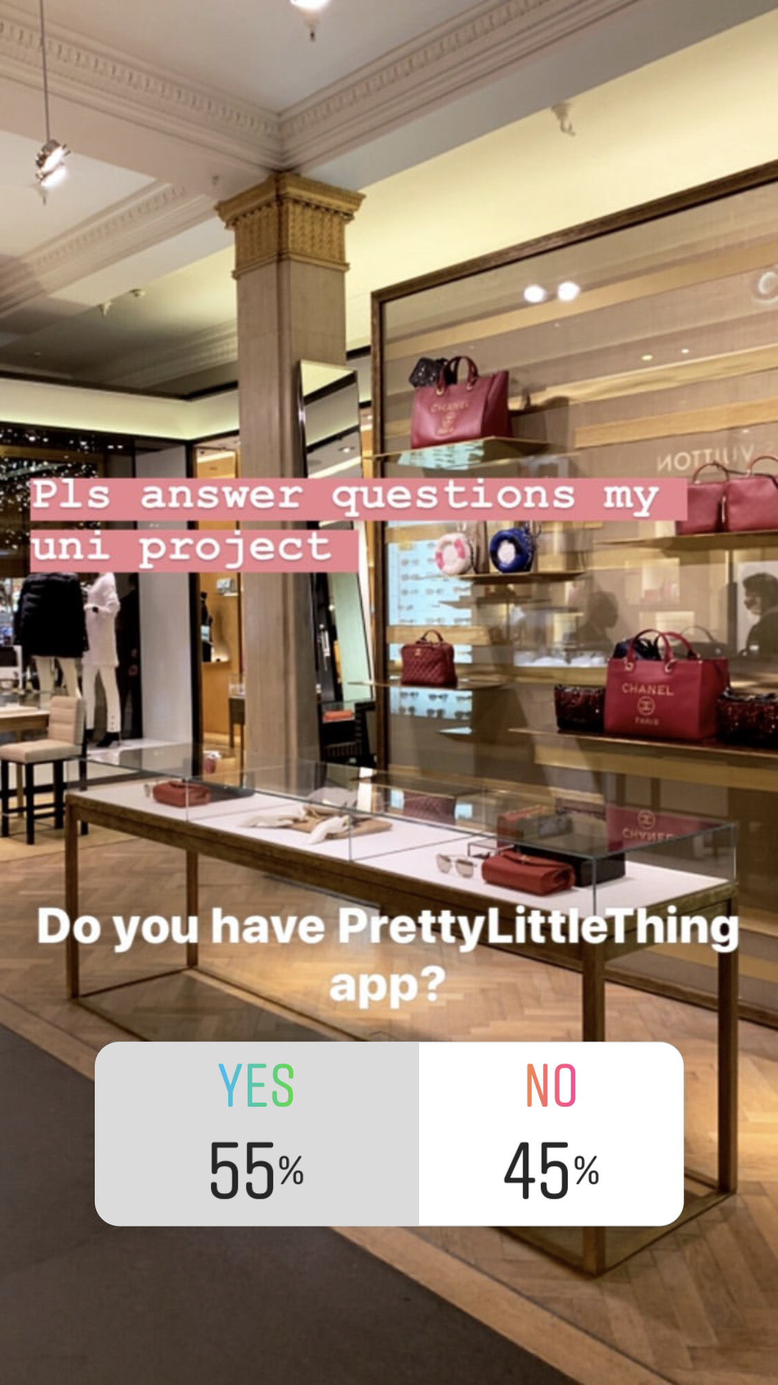
As well as just looking at the shop displays and products we wanted to look into the relationship between a shop and consumer and how these are created and maintained. Brand loyalty is a big part of having a relationship with a store and exclusivity is crucial to maintain this relationship. An app is a prime example of creating that relationship, a consumer has to choose to download the shops app and keep up to date with them. In reward for having the app the store treats the consumer to app only discounts and it can act as a loyalty card when purchasing. This is present in the PLT and Urban Outfitters app which I use very often as these exclusive deals and opportunities really appeal to me and I feel I have a great relationship with these stores. When I asked on an Instagram poll who had the PrettyLittleThing app 55% of 189 boys and girls said that they did have PLT app which shows they have been very successful with creating a relationship with their consumers. PLT often reward their consumers with app only promo codes for things such as 25% off or next day delivery.
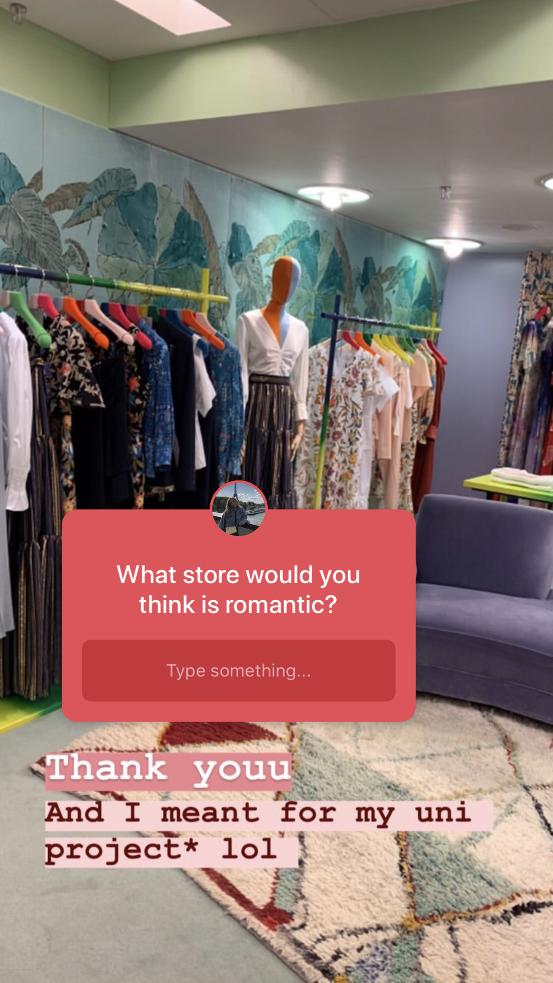
Something which we were asked to do in our brief was to speak to people and get primary research in opinions and reasoning, this was something we struggled to do in shops and we were unsure what and who we could ask to gain the best insight into romance in stores. So I thought of using instagram polls and questions to gain a wide variety of opinions. Here are some of the questions I asked my followers:


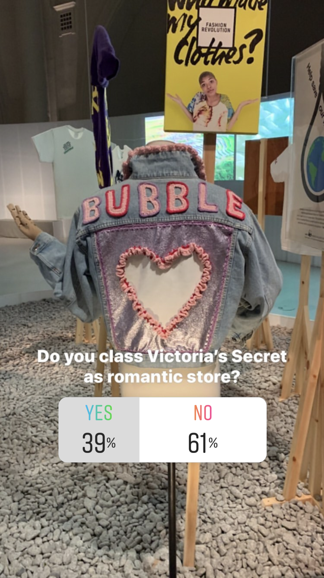

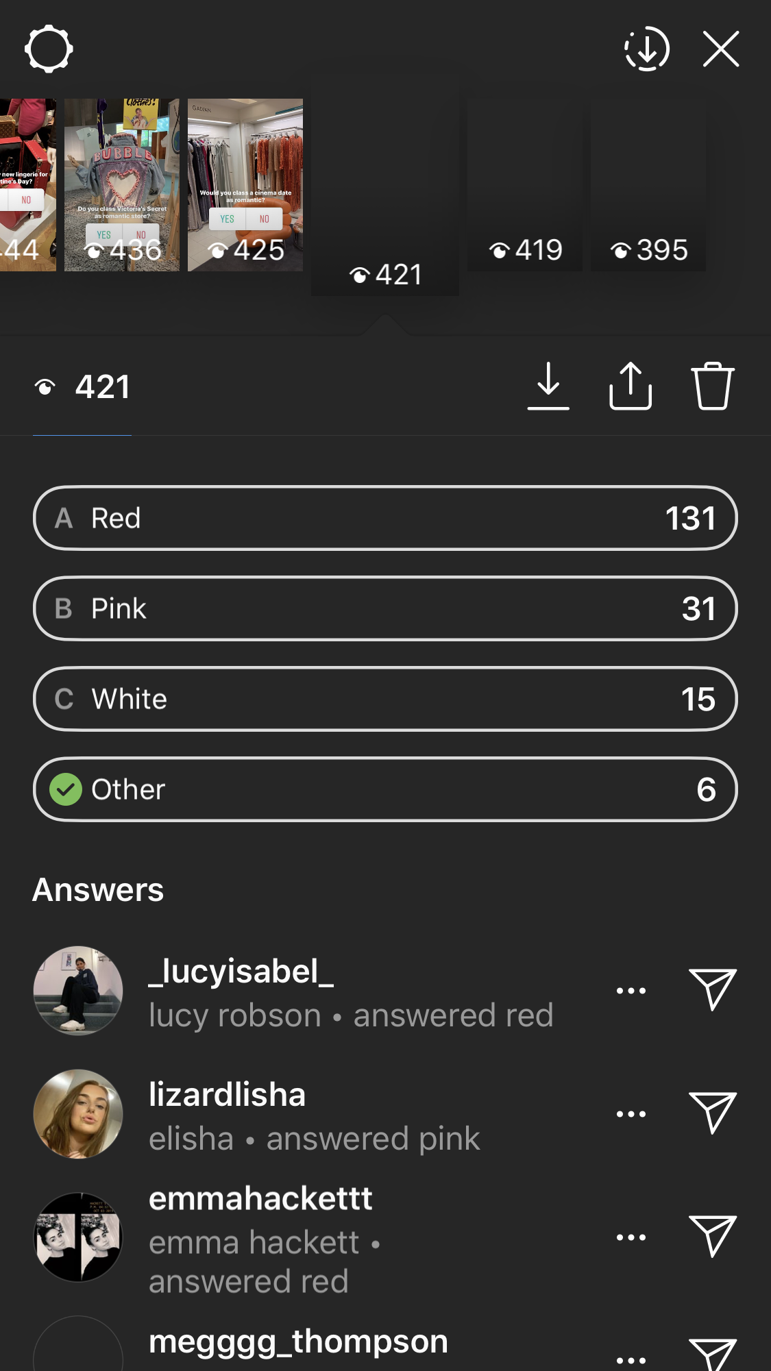

I found from these questions that only 39% of 167 boys and girls thought that Victorias Secret was a romantic store, this is proving that even though the shop sells lingerie (something associated with sex and intimate moments), its actual store displays and layouts don't give off that romantic feel. Something which I found very interesting was the results from the question about what colour do people think is the most romantic, with the results showing 131 people think red, 31 think pink, 15 think white and 6 for other. When I asked this question I thought the answers would be a lot more evenly spread but red was the clear winner, showing that it is the clear colour to use if you want to show something as romantic. When ever we see hearts in shops they are usually coloured red whether they are in displays or the products themselves.
We found a display outside a jewellery store which featured diamond rings with three white roses laid in front of them. White is a colour associated with marriage and roses are a traditional romantic gift to give, so they were very successful in showing their intentions of being a romantic store. When I asked people what one word they would use to describe what they thought was romantic I received the answers; 'Marriage', 'commitment', 'tradition' and 'flowers' all of which are present in this display.

Once we had gathered all of our images and research we came together with the rest of our group to share our findings and to see what they had collected. Together we chose what we thought should be included and found the links between what we had all found in our different sectors which we would like to highlight. Also through this process we were able to see what we were all missing and spoke about what the other members of the group could do to help. We found that the 'People' board was struggling as not many people are wearing very romantic clothing in Autumn/ Winter as their priority is to wrap up. After identifying this we spoke more about what we could look for in people and decided instead of looking for romantic clothing pieces, we could look for more statements and displays of romance between people. This included
couples and friends coordinating their outfits to show their relationship and connection, such

as a couple both wearing a hoodie and jeans or a group of friends all wearing the same trainers, showing how we rub off on one another when we have that close relationship. Broadening our subject made it easier for us to get photos and we all helped to complete this board.
The next stage was to mount our boards and decide what we would all say. We choose to mount onto red card as it was very evident in my research that red was the most recognisable romantic colour. We worked together as a whole group to create the final boards so that we could maintain a consistent look throughout so they were clearly together. We also wrote key words on pink card, which was voted second most romantic colour, so we could show our key points and it made the board more clear to people if we were not there to explain what it was all about.


Here are our final boards, beginning with the history board then the people and finally the shops board. I'm really happy with how they all came out and I believe we clearly showed our trend story and how its shown throughout shops, history and people. The most common link we found in our boards is that the romantic trend is commonly found within women and when men, such as Harry Styles embrace the trend they are seen to be camp or if males give a romantic gesture they are seen to be cringe, this is something I hope with change in the future as we become more open minded and embrace change and trends.
We presented our mood boards to three other groups and one of our lecturers for feedback. The feedback we received was overall very positive, with the recognition that we had all enjoyed working together and had got very invested in our work and enjoyed the project. He identified that we had a very unique narrative and we touched on it in a way that no one else really had. He apprectaited that we didn't just say what our research results were but we went out and found the evidence that this was actually present in stores and backed up what our consumers believed. He said that we should have had more face to face conversations and dissected their thoughts more, which is something we will work on more in future projects. Overall I really enjoyed working with my group on this project, they were all so creative and open minded but also so different so we were all able to input all of our different opinions and ideas to create the best possible outcome.


Comments